9.13 Illustration of the Inverse Relationship between Opportunity and Transaction Costs
The diagram below depicts the inverse relationship between Opportunity and Transaction Costs. You will note that the optimal solution which minimizes both variables appears just to the right of the $300,000 mark on the horizontal axis of the graph. Still, what is the precise and unique solution to the optimal order quantity? It would need to be calculated.
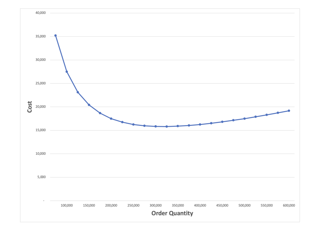
Note that as you go horizontally from right to left, transaction costs go up as order quantities are decreased, and order frequencies are increased. Also, as one goes to the left, opportunity costs decline, as ordering size decreases. The graph takes on a “U”-shape. Again, the bottom point represents the “optimal” order quantity level, i.e., the point at which both transaction and opportunity costs are simultaneously minimized. It needs to be calculated.
- This diagram has been provided by Yedidya Diena (Touro University, Lander College for Men, Class of 2024.)
