8
In this lab exercise, we’ll learn how to chart and display statistical data using SPSS. We will be using the “General_Social_Survey” dataset, which is data from the 2018 General Social Survey (GSS). The GSS is a project of the independent research organization NORC at the University of Chicago, with principal funding from the National Science Foundation. The dataset we’ll be using is a sampling of data from the GSS representing the first 250 cases that had complete data for each of four selected variables. The actual 2018 GSS dataset has over 2,300 respondents and over 1,000 different variables.
First, open the dataset using SPSS. There are four variables listed: the age of the respondent, their family income in constant dollars, the highest degree the respondent has completed, and the frequency of their church attendance.
Click on Graphs and then Chart Builder. SPSS will likely display a warning dialog reminding you to set the measurement level properly for each variable in your chart as well as provide labels for categorical variables. If the measurement level (such as scale, ordinal, or nominal) has not been set, you can click “Scan” and SPSS will scan your dataset and set the measurement level for you. Sometimes it will not identify the correct measurement level, however, so you should use this feature with caution and ensure it is set correctly. Click OK in the warning dialog box to continue.
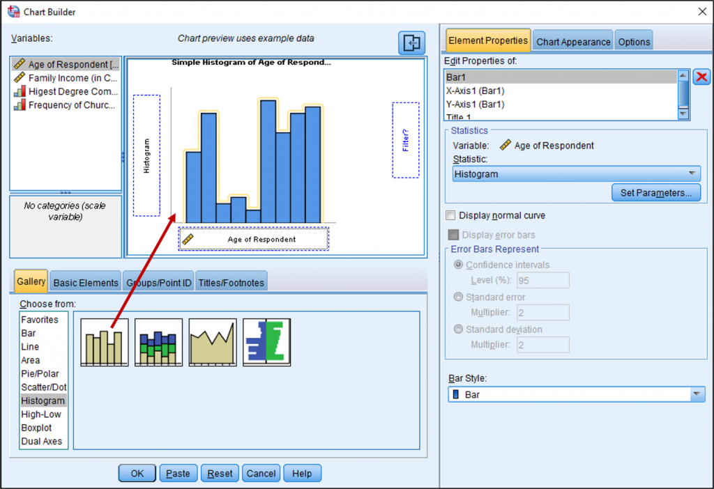
Let’s begin by making a histogram of the ages of the respondents. Click “Histogram” in the gallery and then drag the “Simple Histogram” icon into the chart preview area or double-click it. On a histogram or bar chart, typically the variable is on the X-axis while the frequency is plotted on the Y-axis. So, drag “Age of Respondent” to the X-axis. A preview of your graph should then appear. Note that the preview uses example data and will not necessarily look like your actual dataset. Finally, click OK.
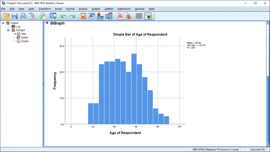
In your Output Viewer window, you should now see a simple bar chart of the ages of respondents.
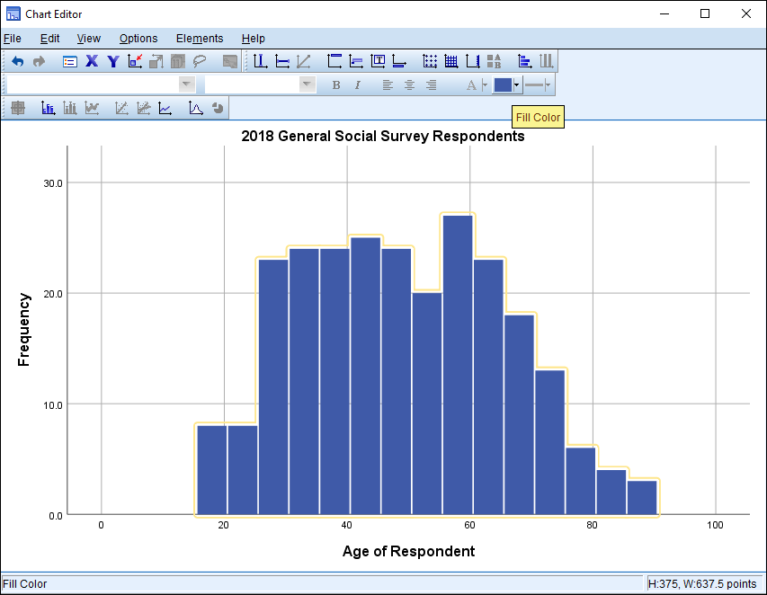
Not too bad for a very quick histogram! But what if we wanted to change some features of our chart, such as the color, titles, or other features? If you double-click the chart in the Output Viewer or right-click the chart and then click Edit Content and then In a Separate Window, the Chart Editor window will appear. Here, there are lots of options to change the look of your chart. Perhaps you don’t need the Mean, Standard Deviation, and number of respondents to be listed on your chart. Simply click this feature on your chart so it is highlighted and press “Delete” on your keyboard. (You can also right-click the highlighted feature and then click Delete on the menu.)
If you would like to change the title of your chart, simply click the title to highlight it and then click again to edit the text.
To change the color of the graph, click the bars and then click the “Fill Color” button on the toolbar. Select the desired fill color.
You can also change many of your graph’s features using the Properties box in the Chart Editor, which is a separate box that appears when the Chart Editor is opened. If you have exited out of the Properties box, you can re-open it by clicking Edit on the Chart Editor menu and then click Properties. You’ll notice a tab labeled “Fill & Border” where you can change the color scheme of your chart.
You might also want to change the intervals used on the X-axis. In the Properties box, click the “Binning” tab. You will see that in the X-axis area, “Automatic” is selected. If you would like, you can change this to custom and either select the number of intervals or the width of each interval. I’ll change the width to 5 so that each bar will represent an age range of five years. When you’re done, click Apply to apply these changes to the chart.
What if you make a change to your chart and wish to undo it? Simply press CTRL + Z on your keyboard or click Edit on the Chart Editor menu and then click Undo.
When you’re all done, exit out of the Chart Editor to get back to the Output Viewer window. Your updated chart should appear in the Output Viewer.
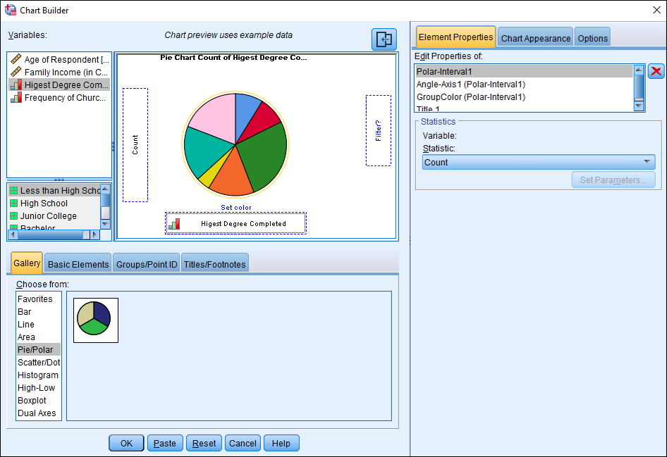
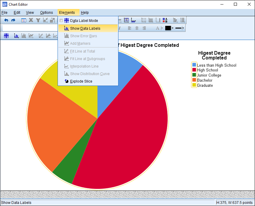
How could you make a pie chart using SPSS? Follow the same steps as before to get to the Chart Builder window. (Click Graphs and then Chart Builder.) Now, click “Pie/Polar” and then click “Pie Chart” in the Gallery options and drag it into the preview area. Let’s explore the highest degree completed by the respondents, so click “Highest Degree Completed” and drag it to the “Slice by?” box. A preview of your chart should appear. Finally, click OK.
In your Output Viewer window, a pie chart should appear displaying the education levels of the respondents. What was the most common education level attained?
The features of your pie chart can be edited in the same way as for the histogram. Simply double-click the chart in the Output Viewer window to open the Chart Editor window. If you would like to change the color of your chart, you can click on each pie slice until it is highlighted and then select the desired fill color. This will change the color in the legend as well. If you would like to change the color to one that is not listed in the color picker menu, you can select any color in the Properties box. Click the “Fill & Border” tab and then click “Edit” below the color swatches. In the first tab, you will find a wider variety of color swatches and separate tabs where you can enter a specific color’s HSV, HSL, RGB, or CMYK numeric values.
One challenge with pie charts is that it is often difficult to compare the size of each slice, so it might be helpful to show percentages for each category. There are several ways to do this. In the Chart Editor window, if you click on your pie chart so there is a circular highlight around all of the slices, you can click on Elements and then click Show Data Labels. Your data labels should appear. You can also click Elements and then check Data Label Mode and click each slice to make the label appear. Uncheck Data Label Mode in the menu when you’re done. Finally, you could right click the slices of your pie chart and then click Show Data Labels.
As usual, when you’re done editing your chart, apply any changes and then exit out of the Chart Editor to return to the Output Viewer window.
