4. Charting and Displaying Data
Illustrating data is a critical skill for geographers, whether those illustrations are graphs, charts, tables, or maps. All illustrations convey information and the best illustrations present this information in a way that is more effective than if the same information was simply listed in the text.
For example, imagine trying to report on country-level economic data. Would it be more helpful to the reader to present a long list of countries and their Gross National Income or to present this same information using a choropleth map?
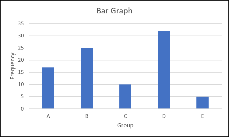
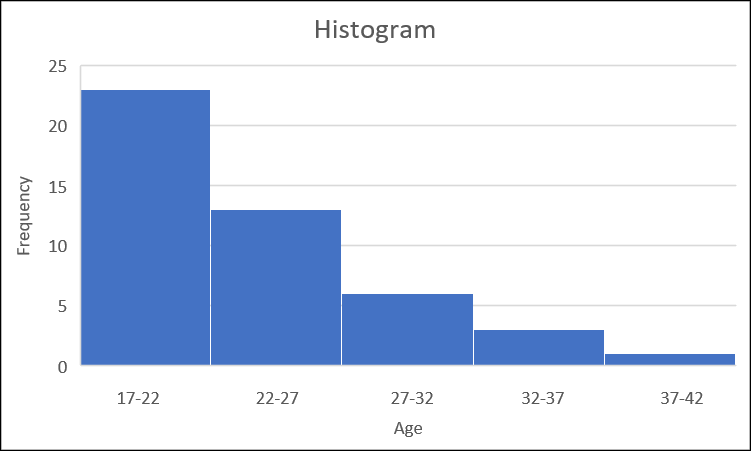
There are numerous different ways to chart data. Among the most common are histograms, bar graphs, line graphs, and pie charts. Histograms are used to display frequencies of values in a continuous, numerical dataset. This dataset is broken up into intervals, with the frequency of each interval charted on the graph. Histograms differ from bar graphs in that the bars of a histogram are touching, whereas gaps are added between the bars on a bar graphs. This is because bar graphs display categorial data and each category is distinct.
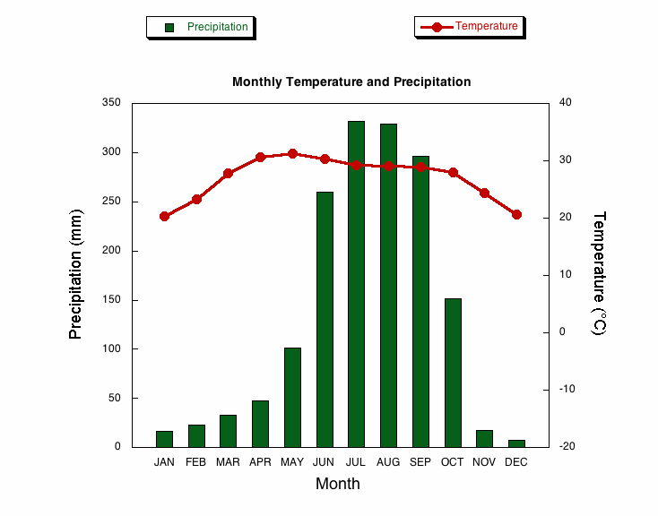
Line graphs display data as a continuous line and are generally used to show changes over time. A climograph is a common graph used by geographers that displays average monthly temperature as a line graph and average monthly precipitation as a bar graph in a way that quickly conveys a particular location’s climate.
Pie charts are used to show proportions but should be used with caution as it can be difficult to actually compare the sizes of sections or to compare data across different pie charts.
