9
In this lab exercise, we’ll learn how to chart and display statistical data using Excel. We will be using the “General_Social_Survey_Excel” dataset, which is data from the 2018 General Social Survey (GSS). The GSS is a project of the independent research organization NORC at the University of Chicago, with principal funding from the National Science Foundation. The dataset we’ll be using is a sampling of data from the GSS representing the first 250 cases that had complete data for each of three selected variables. The actual 2018 GSS dataset has over 2,300 respondents and over 1,000 different variables.
First, open the dataset using Excel. There are three variables listed: the age of the respondent, their family income in constant dollars, and the highest degree the respondent has completed (0=Less than high school; 1=High school; 2=Junior college; 3=Bachelor’s degree; 4=Graduate degree).
There are a variety of ways to make charts using Excel, and a variety of chart types, but let’s start with a simple histogram of the ages of respondents. Highlight all of the responses in the “Age” column, from cell A1 through A251. Then, click Insert and then Recommended Charts. This is a quick way to insert a chart that would be appropriate for the type of data you’ve selected. There are several charts displayed in the window and the type of each chart is specified. Click on the chart labeled “Histogram” and then click OK.
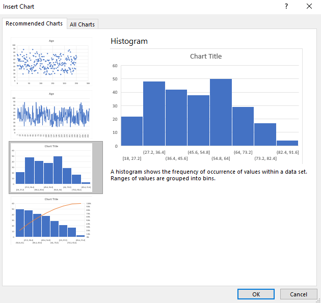
A histogram chart should appear in your Excel worksheet. Notice that the age categories may not be divided into the categories you’d prefer, and the chart title may simply be “Chart Title.” To change the way your data is divided into groups, also known as “binning,” click on the chart, then right click the horizontal axis and click Format Axis.
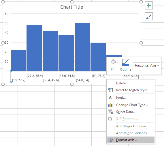
Under “Axis Options,” you should see a section labeled “Bins.” Here, you can adjust the bins created for your data. Try adjusting the bin width to 10, and then click the X to exit out of this menu. Next, let’s change the chart title. Click the chart title to select it, and then click it again to change it to a text selection. Delete the chart title text and add a more appropriate chart title. When you’re done, click outside of chart title to exit the text selection. When the chart title is selected, you can also change the font, size, and color.
You can also change the color of your chart. Simply click on the histogram bars in your chart, then right click and a menu should appear. Click Fill in the menu and then select your desired color.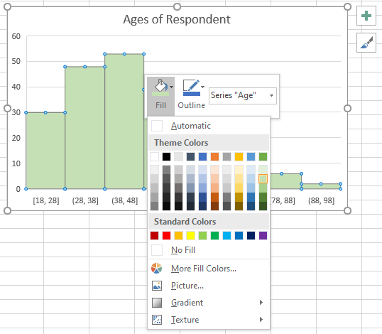
If you make a change and want to undo it, just click CTRL + Z on your keyboard if using a Windows computer, or click the “Undo” arrow at the top right of the Excel window.
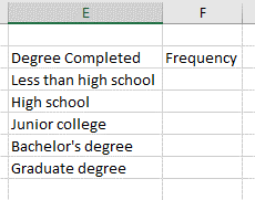
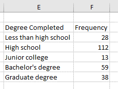
How could you make a pie chart using Excel? Let’s make a pie chart of the degrees earned by the survey respondents. One challenge with Excel is that it does not automatically create frequency charts of data, which would be needed to make a pie chart, so we need to create this first. In cell E2, type: Degree Completed. Then, click Enter. Next, in cell E3, type: Frequency. Click Enter. You may have to resize these columns to fit the text. In our survey, we know that certain responses were coded as numbers, which was explained at the beginning of our lab, so let’s type in these text labels beginning in cell E3 and continuing below.
How do we get the frequencies for each of these survey responses? For this, we’ll use the Excel “Countif” function. In cell F3, type: =COUNTIF(C2:C251,0) and then press enter. This counts how many cells in the range C2 to C251 have a value of 0, which denotes survey respondents who did not complete a high school degree. Type this same formula in the remaining cells F4 through F7, but be sure to change the value to 1, 2, and so on. Also be sure that the range does not change. You can copy and paste the formula while keeping the range the same by using the dollar sign symbol. So, in cell F3, add dollar signs to your formula: =COUNTIF($C$2:$C$251,0). Now, when you copy and paste, the range will stay the same and you’ll just need to change the values. When you’re done, you should have a frequency chart of your data.
Now we’re ready to make a pie chart. Select all of the data in your frequency chart, from cell E2 to F7. Now click Insert and then click the pie chart symbol. Click the first option under 2D pie. A pie chart should appear in your Excel worksheet.
As with the bar chart, you can change the color of your pie slices by either clicking the Design menu at the top of your Excel window and then clicking Change Colors. Or click your chart, double click on the slice you’d like to change so only that slice is selected, then right click and change the fill. Note that changing the fill manually will also change the fill color in your key, which is quite helpful. You can change your chart title the same way as in your bar chart. If you click on the legend to select it, you can change the font and size
You may also want to add data labels, since it can be difficult to compare the proportions of pie slices. To do this, click on your chart and then click on your pie slices so they are selected. Now, right click and click Add data labels. A “Format Data Labels” menu should appear on the right side of your screen offering additional options. Typically, percentages are given rather than values (which are just frequency counts), so you may wish to click the checkbox next to “Percentage” and deselect the “Value” label options.

You can copy and paste your charts into presentations or Word documents by right clicking them and clicking Copy. If you’re pasting them into another Office program, you will have the option to either keep it as a chart (where you can still edit data labels, colors, and fonts), or to paste it as an image.
