12
In this lab, we’ll learn how to compute correlation coefficients using SPSS. We will be using the “World_Bank_Health.sav” dataset which contains health data from the World Bank Development Indicators. Countries with missing or incomplete data have been removed from this dataset.
First, open the dataset using SPSS. There are six variables listed: the name of the country, the gross national income per capita in 2018, the incidences of tuberculosis per 100,000 people in 2018, the prevalence of diabetes as a percent of the population ages 20 to 79 in 2019, the health expenditure per capita in 2017, and finally the number of physicians per 1,000 for 2013 to 2018. All of these variables, with the exception of country name, are scale (or interval) data and would be appropriate to use to calculate the Pearson correlation coefficient. There are other types of correlation coefficients, including Spearman and Kendall rank correlation coefficients, that are appropriate for other forms of data such as ordinal (examining the correlation between income and level of education, for example) but this lab will only cover the Pearson correlation coefficient.
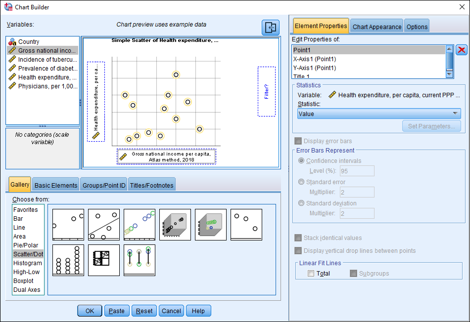
Let’s begin by make a scatterplot to visually display our data. There are a number of different correlations we could explore in this dataset, but let’s see if there is a relationship between a country’s gross national income per capita and its healthcare expenditure per capita. In the Data Editor window, click on Graphs, then Chart Builder, and then Scatter/Dot. If needed, click OK if there is a dialog box asking you to define your chart. The Chart Builder dialog box should open. In the “Gallery” tab, click Scatter/Dot and then double-click on the first example, which is a Simple Scatter. This type of graph should appear in the chart preview area.
Next, let’s select our variables. Remember that the independent variable should always be situated on the X-axis while the dependent variable goes on the Y-axis. Which variable is independent between gross national income per capita and health expenditures per capita? A country’s gross national income most likely impacts its health expenditures. Put another way, a country’s health expenditures are dependent upon a country’s gross national income, so health expenditures would be the dependent variable in this example. Click and drag “Health expenditure” and drop it on the Y-axis area. Click “Gross national income” and drag it to the X-axis box. Finally, click OK.
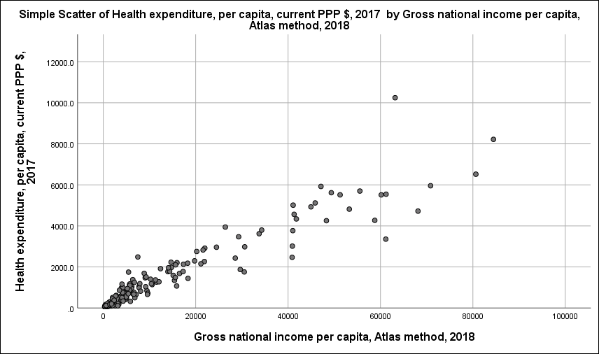
Your scatterplot should appear in the Output Viewer window. How would you describe the correlation just by looking at the graph? It seems like a positive correlation. If you drew a line through the center of these dots, how close would each dot be to the line? Fairly close, right? This suggests that there is likely a strong positive correlation between gross national income per capita and health expenditures per capita. Let’s calculate the Pearson correlation coefficient to see if this is correct.
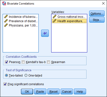
To calculate the correlation coefficient, click on Analyze, then Correlate, then Bivariate. A Bivariate Correlations dialog box should appear. Move “Gross national income” and “Healthcare expenditure” to the “Variables:” box either by double-clicking each variable or by clicking the variable and then clicking the arrow. (You can also hold down the “Ctrl” key to select more than one variable and move them over together.) Make sure “Pearson” is checked under the “Correlation Coefficients” section. Click OK.
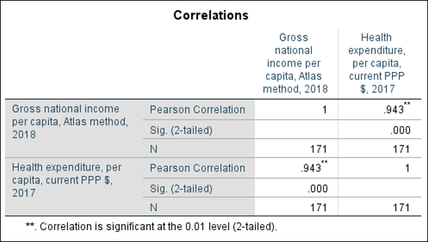
Look at the Output Viewer window. You should now see a table listing your variables and their correlation coefficients. The table also gives you the statistical significance of the correlation, which we will cover in a later chapter. What is the correlation coefficient for GNI per capita and health expenditures for capita? You’ll see it’s quite high at .943. According to the correlation coefficient rule-of-thumb, this would be considered a very strong positive correlation, just as we suspected when we viewed our scatterplot.
What is the correlation coefficient for gross national income per capita and the number of physicians per capita? Create a scatterplot and describe the relationship between these variables. How does this correlation, and the scatterplot, differ from the previous example?
