6. Correlation Coefficients
Pearson Correlation Coefficient
The correlation coefficient is a measure of the strength of the relationship between two variables. For example, most studies show that those who have a higher level of education tend to have a higher level of income. Thus, you might say that there is a positive correlation between the number of years of education and income. If we took a random sample of people and plotted each person’s education level and income on a graph, it might look something like this:
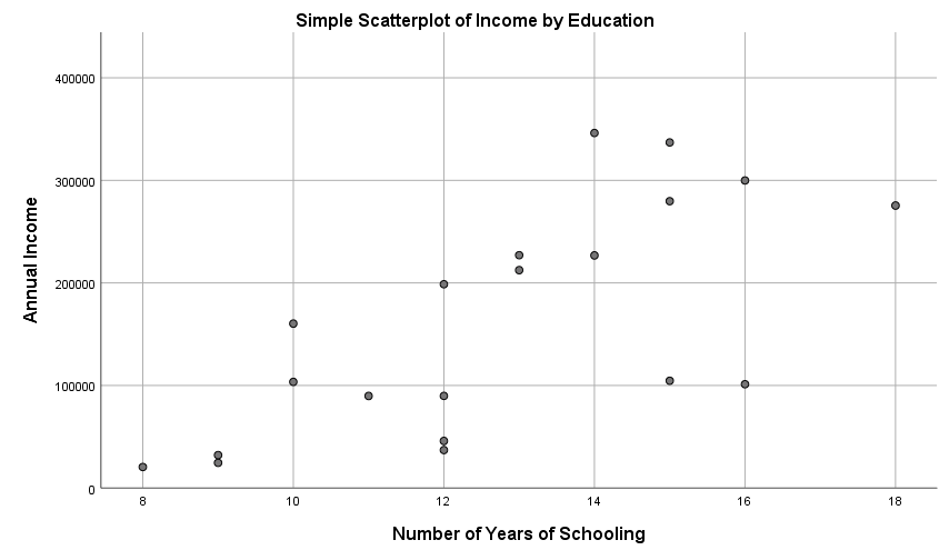
This graph is known as a scatterplot and it is a visual way to represent the relationship between two variables. Each dot represents one case in a sample. In this example, the dot represents a person in our sample. Scatterplots are made simply by plotting the X and Y values. One key item of note is that the independent variable should always be plotted on the x-axis while the dependent variable should be plotted on the y-axis.
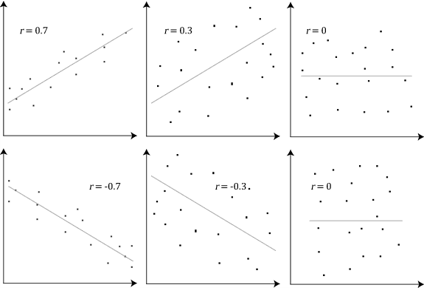
So how can we measure the strength of the relationship between two variables? Essentially, if you plotted a straight line that fit perfectly between the points on your scatterplot, the closer the dots were to the line, on average, the stronger the relationship. The more spread out these points are, the weaker the relationship. The Person correlation coefficient, also known as the Person product-moment correlation or Pearson’s r, is a numerical measure of the strength of that relationship and varies from -1 (a perfect negative relationship) to +1 (a perfect positive relationship). A r value of 0 would mean that there is no relationship between the variables. A variety of r values are displayed on the scatterplots below.
In a future lab, we’ll learn how to test these values for statistical significance, but for now, we’ll just explore how to describe these values and the relationship between variables. There is a general rule of thumb researchers use to describe the strength of these relationships and it is outlined in the table below. Some statistics textbooks might have slightly different values, describing .80 as “very strong” while others limit “very strong” to .90. The descriptions of these values are thus somewhat subjective, but the important idea is to understand that they represent an underlying relationship between two variables. It is also critical to note that the values in the table represent absolute values, so these might be positive or negative depending on the relationship. A correlation coefficient of -.50 is not worse than a correlation coefficient of +.30 just because it’s negative. In fact, an r value of -.50 represents a stronger relationship than a value of +.30.
| Size of Correlation (r) | Strength of Relationship |
| > .90 | Very strong positive/negative correlation |
| .70 – .90 | Strong positive/negative correlation |
| .40 – .70 | Moderate positive/negative correlation |
| .20 – .40 | Low positive/negative correlation |
| < .20 | Negligible positive/negative correlation |
